Creating Eye-Catching Promotional Posters
- May 14
- 4 min read
Updated: Jul 10
Understand Your Audience and Purpose
Before starting any design, clarify who the poster is for and what it should achieve. Different audiences respond to different styles, colors, and messages. For example:
A poster for a music festival aimed at young adults might use bold colors, dynamic typography, and energetic imagery.
A poster promoting a local farmers market could focus on natural tones, clear photos of fresh produce, and a friendly font.
Knowing your audience helps you choose the right tone and visuals. Also, define the poster’s goal clearly. Is it to inform, persuade, or invite? This focus guides every design choice.
Use a Clear and Compelling Headline
The headline is the first thing people read. It must be short, direct, and engaging. Use strong, action-oriented words that create curiosity or urgency. For example:
“Discover the Taste of Summer”
“Join the City Marathon This Sunday”
“Limited Time Offer: 50% Off All Items”
Place the headline prominently, usually at the top or centre, so it grabs attention immediately.
Choose Colors That Communicate and Contrast
Colors influence mood and readability. Select a color scheme that fits the message and stands out in the environment where the poster will appear. For example:
Warm colors like red and orange evoke excitement and urgency.
Cool colors like blue and green suggest calm and trust.
Use contrasting colors for text and background to ensure readability from a distance. Avoid using too many colors, which can confuse the eye. Stick to two or three main colors for a clean look.
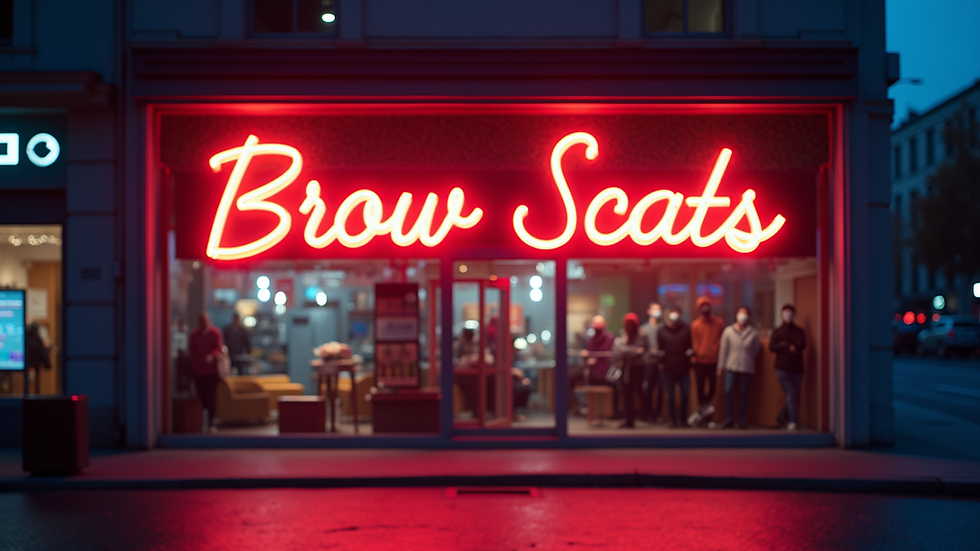
Use High-Quality Images and Graphics
Visuals are powerful in drawing attention and conveying messages quickly. Use high-resolution images that relate directly to the poster’s content. Avoid cluttering the poster with too many images. Instead, choose one strong image or graphic that supports the headline.
For example, a poster for a theatre play might feature a dramatic close-up of the lead actor, while a poster for a food event could show a mouth-watering dish.
Keep Text Minimal and Focused
Posters are not the place for long paragraphs. Use brief, clear phrases or bullet points to communicate key information such as:
Date and time
Location
Contact details or website
Special offers or highlights
Use legible fonts and size the text so it can be read from a distance. Avoid mixing too many font styles; two complementary fonts are usually enough.
Create a Visual Hierarchy
Guide the viewer’s eye through the poster by organizing elements in order of importance. The headline should be the most prominent, followed by images, then supporting text. Use size, color, and placement to create this hierarchy.
For example, the headline might be the largest text in a bold colour, the image centred or aligned to one side, and the details in smaller, simpler fonts at the bottom.
Use White Space Effectively
White space, or empty space, helps prevent the poster from feeling crowded. It makes the content easier to read and highlights important elements. Don’t be afraid to leave gaps around text and images. This breathing room improves overall clarity.
Consider the Viewing Distance and Location
Think about where the poster will be displayed and how far viewers will be. Posters meant for busy streets or large venues need larger text and bolder visuals to be seen from a distance. Posters inside a store or event space can have smaller details since viewers are closer.
Adjust your design accordingly to maximize impact.
Test and Get Feedback
Before finalising your poster, print a test copy and view it from different distances. Ask others for feedback on clarity, appeal, and message. Sometimes what looks good on screen doesn’t work as well in print or real life.
Make adjustments based on this feedback to improve effectiveness.
The Importance of Consistency in Branding
When creating promotional posters, consistency in branding is crucial. Your poster should reflect your brand’s identity, including its colours, fonts, and overall style. This consistency helps reinforce your brand image and makes it easier for your audience to recognise your business.
For instance, if your brand uses a specific shade of blue, ensure that this colour appears in your poster. This not only strengthens brand recognition but also creates a cohesive look across all your marketing materials.
Incorporate a Call to Action
A strong call to action (CTA) is essential in promotional posters. This phrase encourages viewers to take a specific action, such as visiting a website, calling a number, or attending an event. Make your CTA clear and compelling. For example:
“Visit us online for more details!”
“Call now to reserve your spot!”
“Don’t miss out – register today!”
Position your CTA prominently on the poster, ensuring it stands out from other text and visuals.
Leverage Social Media
In today’s digital age, integrating social media into your promotional posters can enhance their effectiveness. Include your social media handles or a QR code that links to your profiles. This encourages viewers to engage with your brand online and keeps them updated on future events or promotions.
For example, you might add a line like, “Follow us on Instagram for exclusive updates!” This not only drives traffic to your social media but also builds a community around your brand.
Conclusion
Creating eye-catching promotional posters is a skill that combines creativity with clear communication. By understanding your audience, using strong headlines, choosing the right colours and images, and organizing content thoughtfully, you can design posters that not only attract attention but also inspire action. Remember, the goal is to create a visual experience that resonates with your audience and effectively communicates your message.
With these tips, you can elevate your poster designs and ensure they stand out in any setting. Whether you’re promoting an event, launching a product, or sharing a campaign, a well-crafted poster can significantly enhance your brand visibility and engagement.
So, let’s get started on designing posters that truly reflect your brand and captivate your audience!


Comments